Flexible Style
The Canada Economic Development for Quebec Regions (CED) provides funding and support to Quebec businesses and regions.
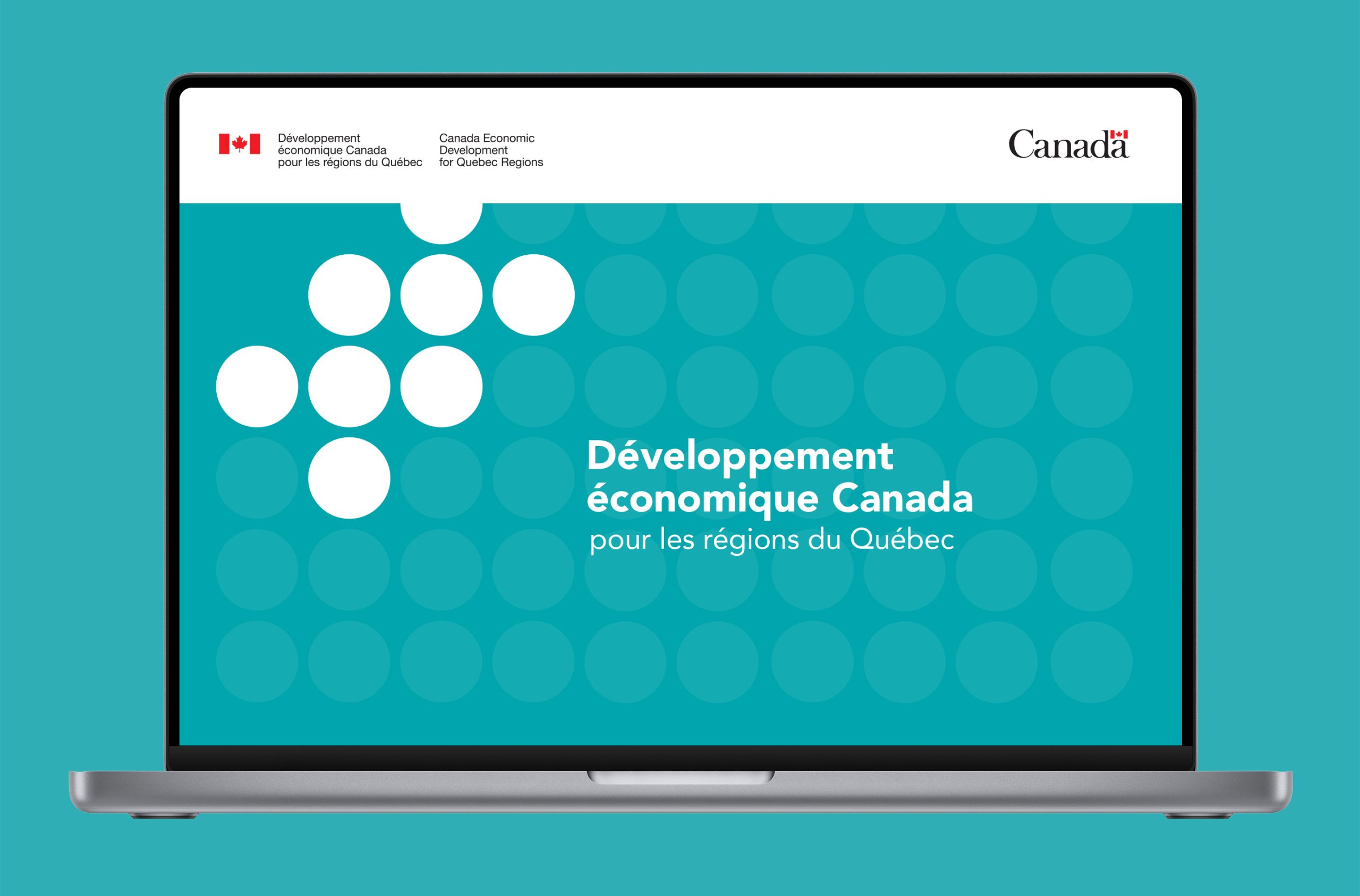
The department was looking to develop a new, modern design language to use across all of their internal and external communications. The mandate was a simple visual with unique and extremely flexible characteristics.
Client
Développement économique Canada pour les régions du Québec
Services
Brand strategy, Logotype, Page layout, Art Direction
Year
2019
The challenge with this project was creating a visual style that could scale to many pieces, existing and to come, and remain simple enough to be used by many employees across a federal government department.
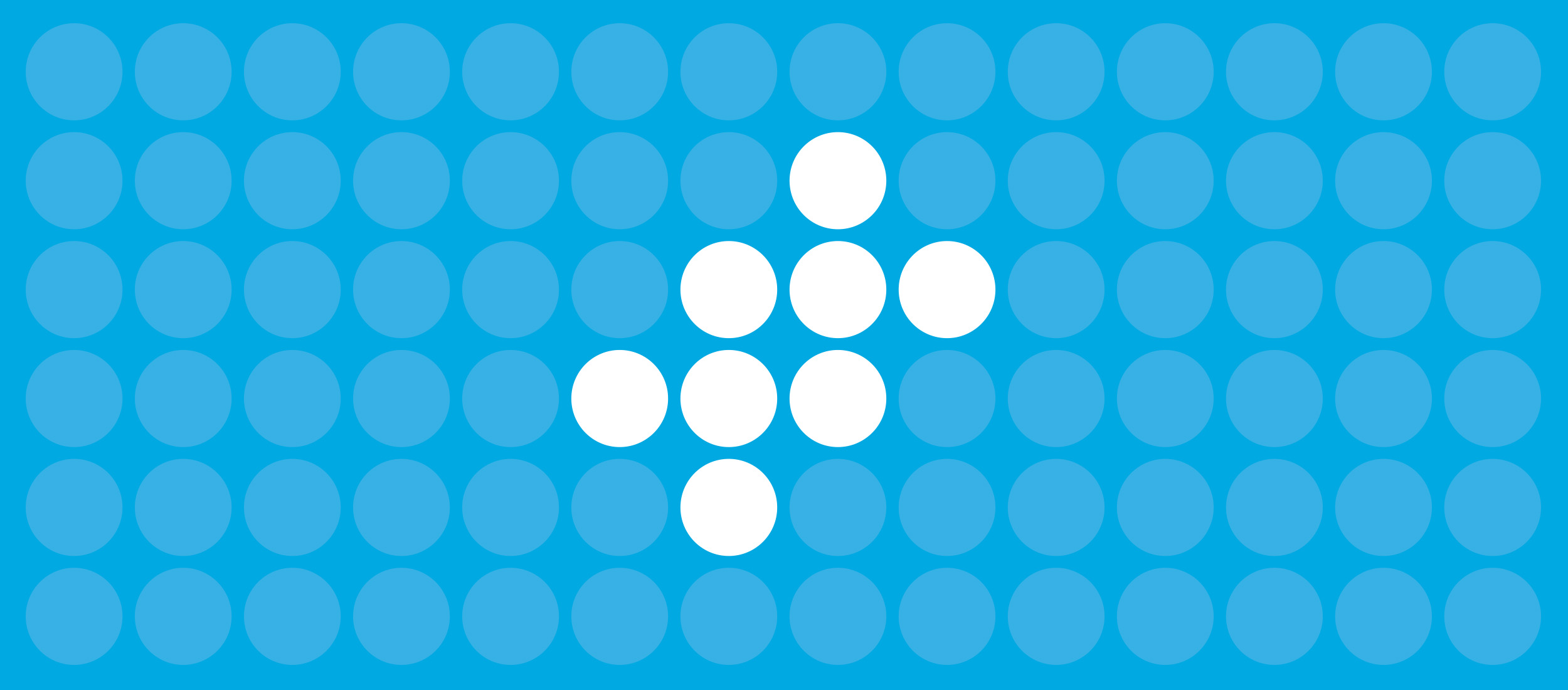
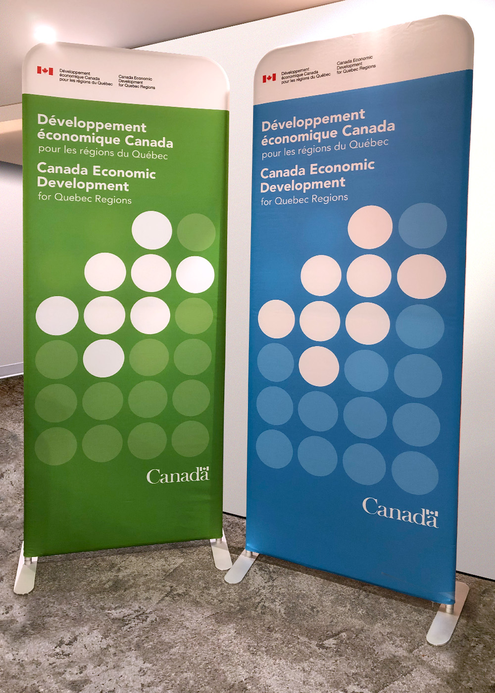
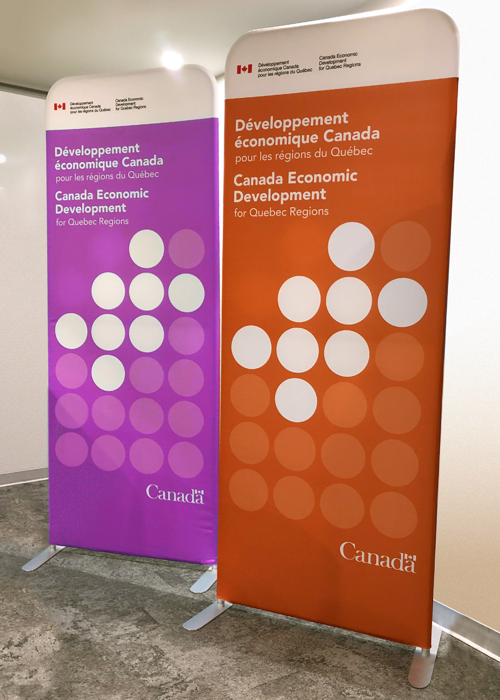
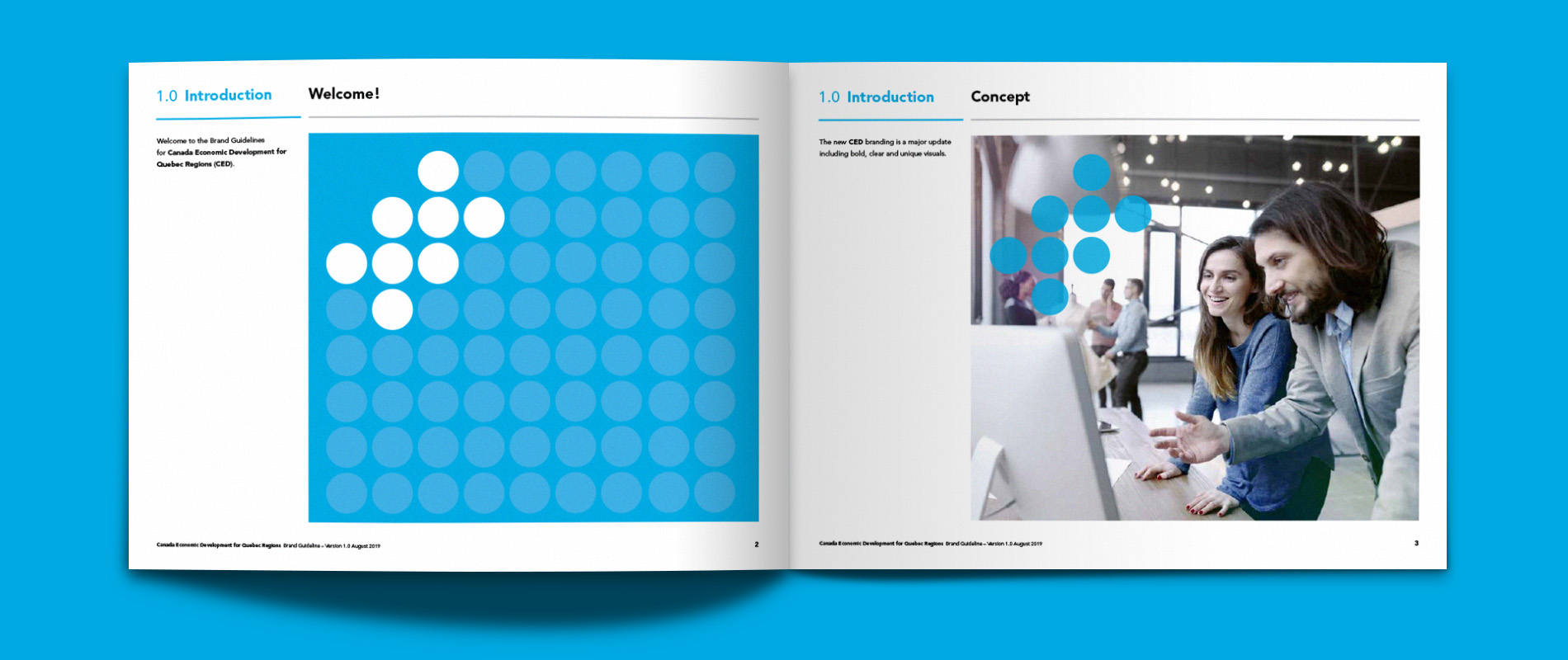
The symbol represents the regions of Quebec, which forms the larger unit. It scales easily and is instantly recognizable.
A bright colour palette was developed so in the CED team would have options when building reports, presentations and other communication pieces.
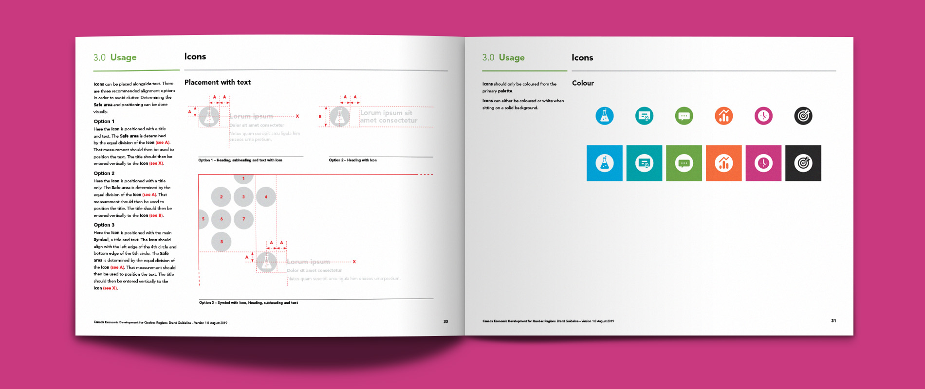
To complement the new branding, a family of icons were created. They needed to be clear and work with the new palette and at different sizes without loosing their meaning.
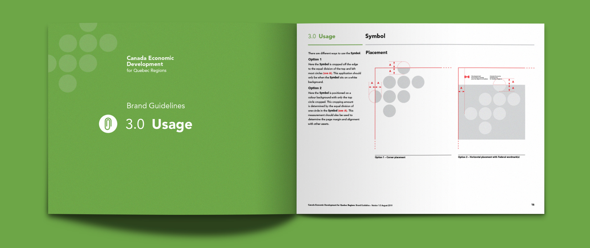
Once the new branding system was established and tested, the CED requested a thorough branding guide to allow the team to build consistent looking pieces.
